1. Short Description
In the context of the 7SHIELD
project, the main goal of the Cyber-physical Threat Monitoring Dashboard
(CPTMD) is to provide a unified monitoring solution to support Satellite Ground
Segment operators during the decision making phase, combining security threat
monitoring and event management,
The CPTMD
provided a constant monitoring of the status of the critical infrastructure is
a great advantage as we use the latest technologies and a variety of devices to
monitor this state and always be aware of what happens to prevent or take
mitigation actions with respect to critical events.
2. Main Purpose and Benefits
The Cyber-physical Threat
Monitoring (CPTM) Dashboard can detect and monitor the evolution of cyber and
physical threats affect the Satellite Ground Segment (SGS). In the context of
the 7SHIELD project, the main goal is to provide a unified monitoring solution
to support SGS operators during the decision making phase, combining security threat
monitoring and event management. SGS operators can analyse single threats and
also can access to correlated data representing potential complex scenarios.
These data are represented using the same look and feel so that the operator
can easily jump from one type of threat to another one. A visual map of the CI
site presents all the available information about CI areas and assets as well
as simple and complex threats. The combination of physical and cyber threats
helps the operator to have a global view of the threats and possibly anticipate
the risk of combined scenario by visual alerting.
The
CPTM Dashboard has been developed as a web interface. From a technological point of
view, the approach is to use standard Web 2.0 technologies including HTML
(standard mark-up language for creating web pages), CSS (for styling the look
and pages presentation, including colours, layouts and fonts) and JavaScript
(for handling interactive effects). Any data present on the map
will be accessible through the Geographic Information System (GIS) technology
provided in Geo-JSON form.
3. Main Functions
The main features of the CPTM
Dashboard are:
The General platform Features support
the SGS user to access generic operations of the dashboard (Refresh, User
Information).
The CPTMD is a centralized module,
through the CPTMD is possible to access the other tools by Resiltech,
Engineering, CeRICT and Satways in a full screen mode. This module integrates
the Single Sign-On system provided by SERCO.
The CPTMD allows
the user to visualize the main information regarding the SGS status in real
time.
The frame
Situational Awareness visualises a list of situations. Here there are two tabs (Current
Situation and Historical Stuations): in the Current Situation tab the situation
to be managed is depicted, while in the other tab, historical situations are
displayed.
In the SGS
Infrastructure area, the information regarding the areas (or sectors) of the
SGS are visualized. The Area tab visualizes a list of sectors with related
assets included.
The CPTMD allows
the user to receive notifications of any data changes in the system.
4. Integration with other Tools
The CPTM Dashboard communicates directly with the Situational
Picture Generation and Update (SPGU) component, through the REST API Services
and WebSocket protocol. The CPTM Dashboard handles the visualization while the
SPGU component exposes a secured REST API toward it, with a client server
communication. Moreover, the CPTM Dashboard communicates with the Situational
Picture Generation and Update (SPGU) with the WebSocket protocol. The WebSocket specification defines an API
establishing "socket" connections between a web browser and a server.
In plain words: There is a persistent connection between the client and the
server and both parties can start sending data at any time.
Every
time the SPGU component updates the Situational Picture (with data from the Kafka
Broker), through the socket connection. The CPTM Dashboard visualises the
notification alert and invokes the corresponding rest service to receive the
data that has been updated.
The CPTM Dashboard can integrate
external dashboards (see other
dashboards section) via iFrame. An inline frame (iframe) is a
HTML element that loads another HTML page within the document. It essentially
puts another webpage within the parent page. It is supported by all major web
browsers and is included in the lates HTML5 specifications.
Finally, the CPTM
Dashboard has a full compatibility with authentication systems. It is
integrated with the 7SHIELD Keycloack SSO instance.
5. Infrastructure Requirements
The Cyber-physical Threat
Monitoring (CPTM) Dashboard is deployed as a service at the URL “https://7shield-fe.eng.it”.
As
required software are:
·
Docker v.18.06.01-ce - or later versions
·
Docker-compose v.1.22.0 - or later versions
·
Git v2.17.1 - or later versions
The hardware required is:
·
CPU: 4 64-bit cores or more
·
RAM: 8GB or more
·
Disk: 40 GB or more
·
OS: Any system supporting the Docker engine
6. Operation Manual
6.1 Set-up
The Cyber-physical Threat
Monitoring (CPTM) Dashboard is installed using docker with a docker-compose
file, all the configurations for the deploy are contained in the “.env”
configuration file of the tool
6.2 Getting Started
Each
user has to be authenticated before using the CPTMD functionalities. The
authentication is based on a set of unique credentials (username/password) that
each user has. Using the login form, users are requested to fill in their
credentials in order to log in to the system. Upon their authentication, the system
provides the user with information and a list of functionalities.
7. User InterfaceThe first step to access to the Cyber-physical Threat Monitoring Dashboard is to insert the log-in information, namely the Email and the Password and click on the Sign In button (Figure 1)
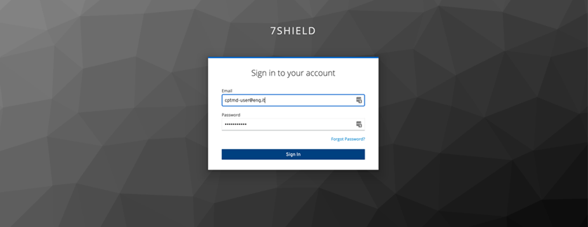
Figure 1: Cyber-physical Threat Monitoring Dashboard Login screen
Figure 2 visualises the Cyber-physical Threat Monitoring Dashboard home page
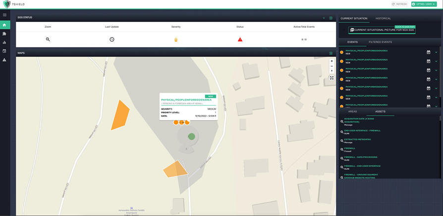
Figure 2: Cyber-physical Threat Monitoring Dashboard Home Page
Clicking on  , there is a redirect on the site of the project (Figure 3).
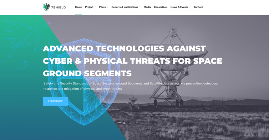
Figure 3: 7Shield Site Project
The Cyber-physical Threat Monitoring Dashboard is divided in sections, let's analyse them in detail.
7.1 General Platform Features Section
This general section, visible in the highlighted section in Figure 4 of the home page, allows the User in every point of the platform to access the generic operations of the Dashboard (Figure 5)
Figure 4: General Platform Features Section in the Home page
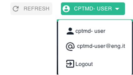
Figure 5: Cyber-physical Threat Monitoring Dashboard Header Bar
7.2 Other Dashboard Sections
In this section, visible in the highlighted section in Figure 6 of the home page, there are the other independent external dashboards (e.g., web applications) that are available through the Cyber-physical Threat Monitoring Dashboard. In Figure 7 a list of other dashboards.
Figure 6: Other Dashboard Section in the Home page
Clicking on  link is possible to access the MDBA Tool in a full screen mode (Figure 8)
Clicking on  link is possible to access the DIVA Tool in a full screen mode (Figure 9)
Clicking on the  link, is possible to access the Cyber Attack Dashboard in a full screen mode (Figure 10)
Figure 10: Cyber Attack Dashboard
Clicking on the  link, is possible to access the Tool in a full screen mode (Figure 11)
Figure 11: Risk Assessment Tool
7.3 Status of the SGS Section
The frame Status of the SGS, visible in the highlighted section in Figure 12 of the home page, allows the User to visualize the main information regarding the SGS status in real time. (Figure 13)
Figure 12: Status of the SGS Section in the Home page
Clicking on  is possible zooming the map in the centre of the SGS area.
On mouseover  is possible to view the last update date of the SGS (Figure 14)
Figure 14: Last update date information
Mouseover on  allows the SGS User to visualise the Severity information in real-time (Figure 15)
Figure 15: severity information
Mouseover on  it is possible to view the Status of the SGS in real-time (Figure 16)
Figure 16: SGS status information
Figure 17 visualises the number of active events on the total of events.
In the SGS Status Bar there are two buttons for resizing this section (Figure 18)
Clicking on  , the SGS User can hidden the section (Figure 19)
Figure 19: Hidden the SGS Status Bar
Clicking on  , the SGS User can expand the section (Figure 20)
Figure 20: Expand the SGS Status Bar
7.4 Situation Awareness Section
The frame Situational Awareness, visible in the highlighted section in Figure 21 of the home page of the Cyber-physical Threat Monitoring Dashboard, visualises a list of situations. There are two tabs (Current Situation and Historical situations): In the Current Situation tab (Figure 22) the situation to be managed is presented.
Figure 21: Situational Awareness Section in the Home page
Regarding the Current Situation, the information is divided in two tabs: Events (Figure 23) and Filtered Events (Figure 21).
The Events Tab (Figure 23) allows the SGS User to visualise the list of Events regarding the Current Situation
Figure 23: Event List
In the list, if present, clicking on  button, allows the user to visualize the
impact areas/assets for the selected event (Figure 24)
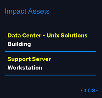
Figure 24: Impact Assets
For each element of the list, by clicking on a single event, the map zooms in on the event (Figure 25) and the detail is displayed (Figure 27)
Figure 25: Event in the map
The single event can be located in a point (Figure 25) or in an area (Figure 26)
The resources icons  if are present, allows the SGS User to visualise the resources (images, videos, audio files, other resources) associated to the event selected (Figure 28).
Figure 28: Resources associated to the event
In the Current Situation, clicking on the ' Filtered Events' tab, the filtered button is shown (Figure 29).
Figure 29: Filtered button clicking on Filtered Events Tab
Clicking on  button allows the SGS User to filter the events for data (Figure 30).
Figure 30. Event filtered for data
Clicking on  button, the filtered Event Tab, visualise the filter events (Figure 31).
Figure 31: Filtered Events Tab
Finally, clicking on  , SGS user to export the filtered Events (Figure 32)
Figure 32. PDF file for Events Filtered
In the Current Situation tab, clicking on the  button, The SGS User to export the Current Situation in pdf file (Figure 33).
Figure 33: Current Situation pdf file
Finally, in the Historical tab, the situations that have already been managed and concluded are presented (Figure 34).
Figure 34: Historical Situations
For each situation on the list, a short description, the creation data, and a circle with the colour of the severity (green, yellow or red) are shown. The data present for each situation are of the same type as the current situation, the situation being closed, all information will be visible in read-only mode (Figure 35).
Figure 35: Historical Situation detail
7.5 SGS Infrastructure Section
In the SGS Infrastructure Section, visible in the highlighted section in Figure 35 of the home page, are visualising the information regarding the areas (or sectors) of the SGS (Figure 37). The Areas tab can visualise a list of sectors with assets included, instead the Assets tab visualising the assets not included in any sector.
Figure 36: SGS Infrastructure Section in the Home page
Figure 37: SGS Infrastructure list
For each element of the list (Figure 38), the Cyber-physical Threat Monitoring Dashboard allows the SGS User the following operations:
Figure 38: Sector Area
Clicking on the  icon is possible to zooming the map on centre of the sector (Figure 39)
Figure 39: Sector (Antenna Fence) Area in the Map
Clicking on the sector area the popup (Figure 40) shows the Sector information
Figure 39: Antenna Fence Popup in the Map
Clicking on the  icon, icon the SGS User can visualise the Risk Assessment information (Figure 41)
Figure 41: Risk Assessment information for selected Area in relation to Physical Information Gathering.
It’s possible to visualize the risk assessment information in relation of the different types of attacks, where the area is more vulnerable (Figure 42).
Figure 42: Risk List for the selected area.
Clicking on the  , the SGS User can visualise other information, priority,
warning level (Figure 43) and the weaknesses
information (Figure 44).
Figure 43: Other information for selected area.
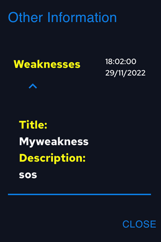
Figure 44: Other information (Weaknesses) for selected area
Clicking on  the SGS User can visualise the Average
Risk (Figure 45)
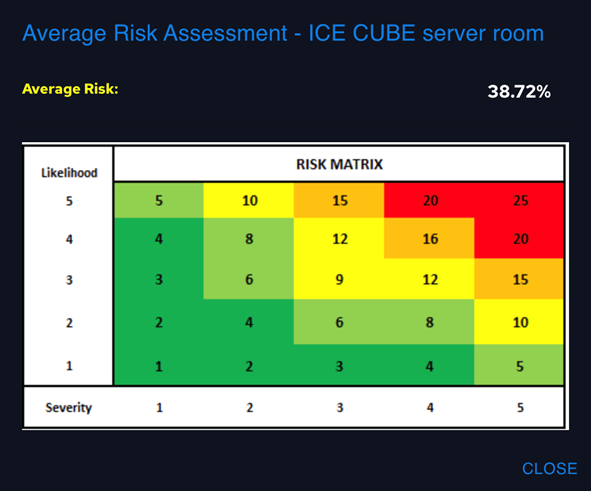
Figure 45: Average Risk for the selected area
In the Areas/Assets area, clicking
on  the SGS User can filter the Areas/Assets
for name and/ or visibility in the map (Figure
46).
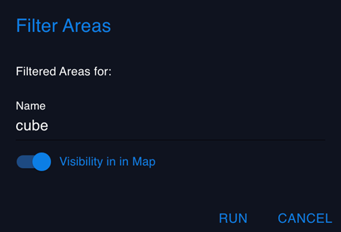
Figure 46: Filtered Areas for name
and/or visibility in the map
Clicking on t the filtered Event Tab, visualise the
filter events (Figure
47).

Figure 47: Filtered Areas
Clicking on  , the original list is restored
7.6 Map Features
The Map (Figure 48) is used for visualising all georeferenced information such as perimeter of the SGS, Sectors, Assets and Events.
Figure 48: Map in the Home Page
Clicking on the  button, the SGS User can expand the Map in the home page (Figure 49)
Figure 49: Expand Map in the Home Page
It is also possible to view the map in full screen mode (Figure 50) clicking on  .
.
Moreover, clicking on  it is possible to zoom in and zoom out in the map.
Finally, is possible to click on  to change the perspective angle of the map (Figure 51).
Figure 51: Map with different perspective angle with different perspective angle
The Cyber-physical Threat Monitoring Dashboard allows you to receive notifications of any data changes in the system. For example, when a new situation is opened, or when a new event is added or updated. Notifications will be displayed with a popup alert which will be displayed for 30 seconds